

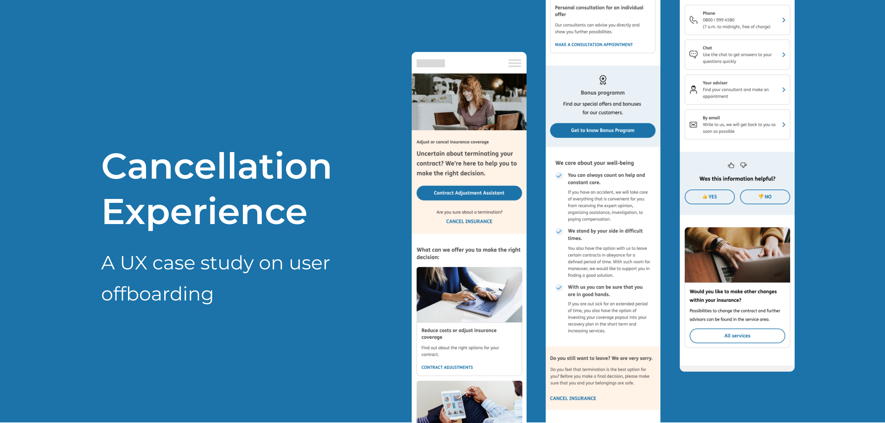
Cancellation process
Breaking up is never easy. The decision of leaving is usually followed by unfavorable circumstances. It often comes with a wide range of emotions and negativity. Therefore, it is very important to guide users during the cancellation process so that they feel supported in finding the best solution for their needs, quickly and intuitively with no frustration.
Below I would like to introduce a landingpage approach that focuses on providing a pleasant offboarding experience while minimizing the rate of cancellations. I will point out the most relevant findings I came up with while working on the contract cancellation process for the insurance industry.
UX challange
- Design a user-friendly and sustainable digital solution that enables customers to cancel their insurance contracts easily and effectively.
- Currently, there is no existing digital cancellation process.
- The solution should address the needs of both the customer and the business.
My role
During this project I worked as UX Designer collaborating closely with a diverse group of stakeholders, including the UX Lead, Ideation Lead, Business Product Owner, Epic Owner, Business Analyst, and developers, forming a dynamic cross-functional team. Our collaboration primarily took place during the ideation phase, where I assumed the role of determining the overarching project direction.
Within this role, I was responsible for identifying an optimal solution that effectively addressed the specific problems faced by the target users.
Design process & Activities performed
For this project I followed Design Thinking Process using a range of suitable methods, tools, and frameworks. This systematic approach enabled me to address the challenges and opportunities effectively, while keeping the user at the center of the design process.
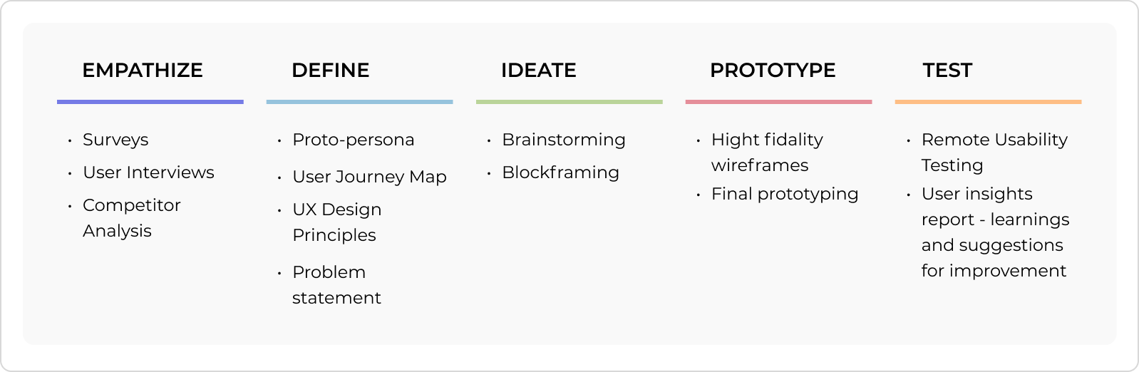
1. EMPATHIZE
I began by empathizing with users, gaining a deep understanding of their needs, pain points and aspirations. I analyzed existing data that the business and researchers had already collected, such as user interviews, surveys and competitors analysis.
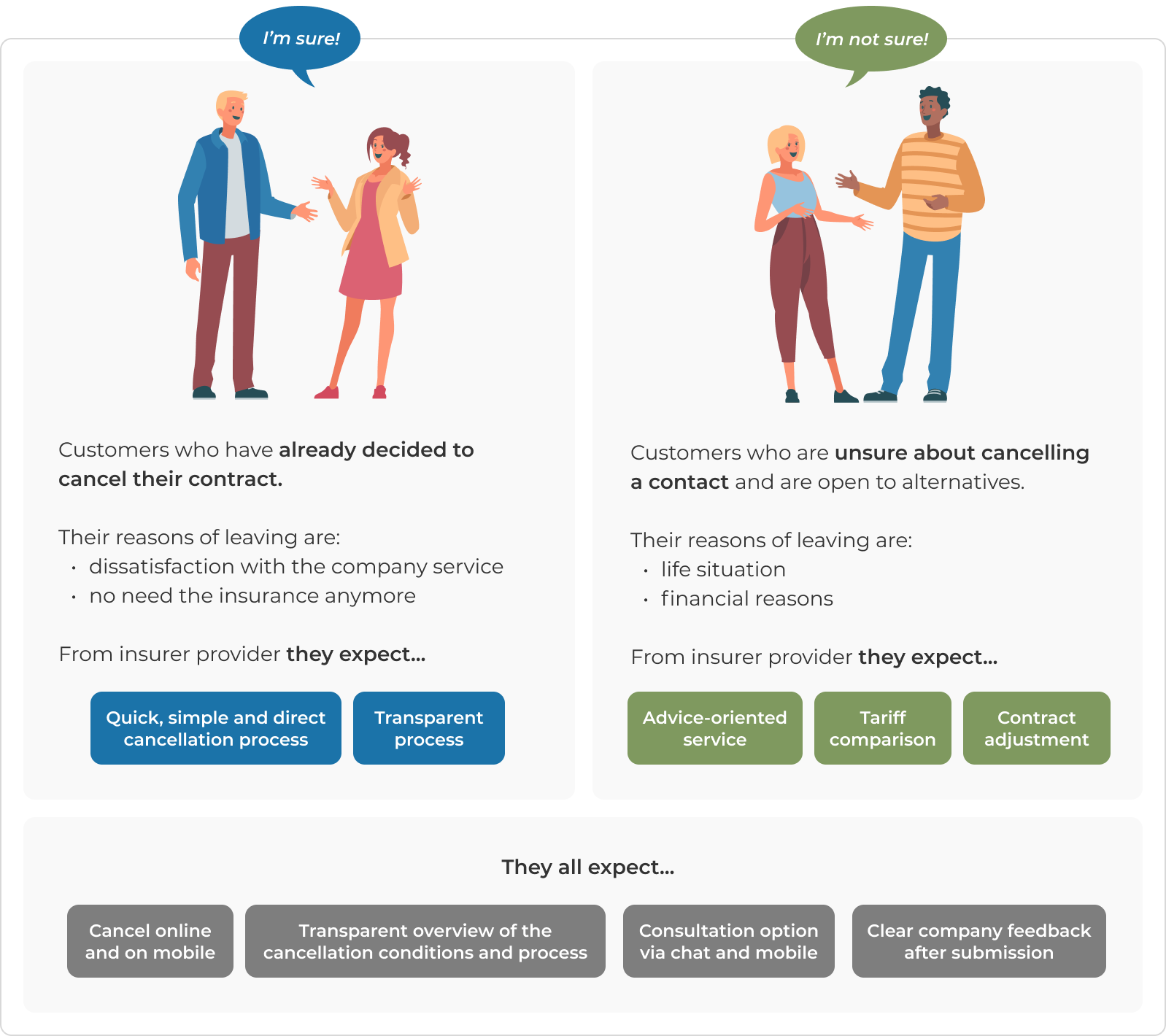
During the analysis two user groups emerged:
Based on user feedback I defined UX design principles to follow during further design development:
- Digital & mobile cancellation
Customers want a digital cancellation service from their insurance company that can also be operated via smartphone - Quick, simple, direct termination
Customers want their insurance company to provide a quick, simple and direct termination process without distractions - Keeping an overview of the cancellation status
Customers want their insurance company to provide them with a transparent overview of the cancellation periods and cancellation status of their contracts when they cancel. - Enable online tariff change service of contracts
Customers want to be able to adjust their contracts digitally via an online service so that they can change their insurance benefits without much effort, depending on their life situation and needs. - Provide comparison overviews of suitable tariff offers
Customers are open to other tariff offers in the context of an online cancellation, provided it is optional and they are clearly and transparently informed about prices, benefits and differentiations from their previous contract in the first step - Enable optional consultation with an insurance expert in the event of a change
Customers would like to have the option – if it becomes necessary for them – to consult with an insurance advisor by telephone about a policy change.
2. DEFINE
This phase involved synthesizing the gathered information to create user personas, journey maps, and problem statements. These artifacts provided a clear picture of the issues to be addressed and guided the subsequent steps.
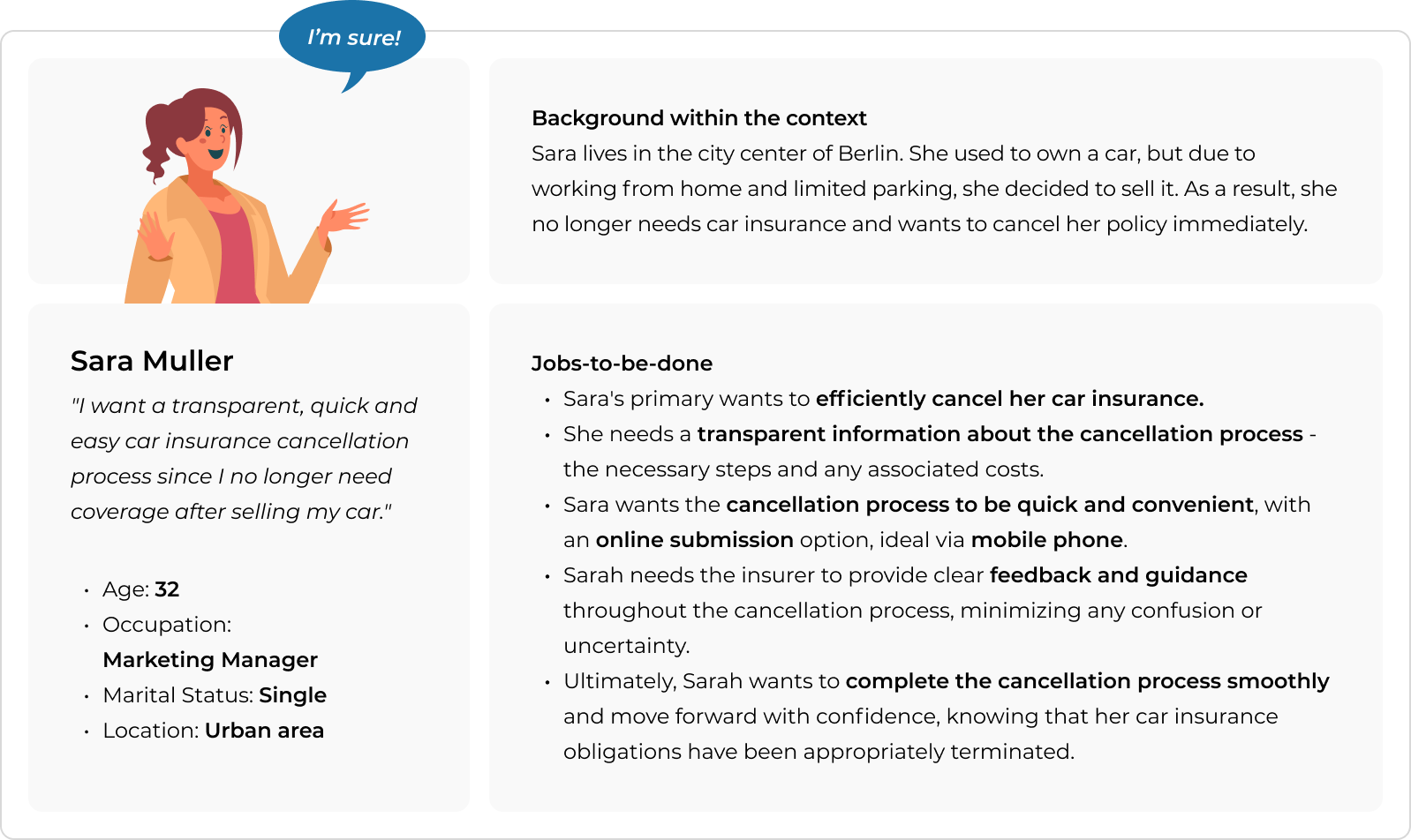
Proto-Personas & User Journey Map
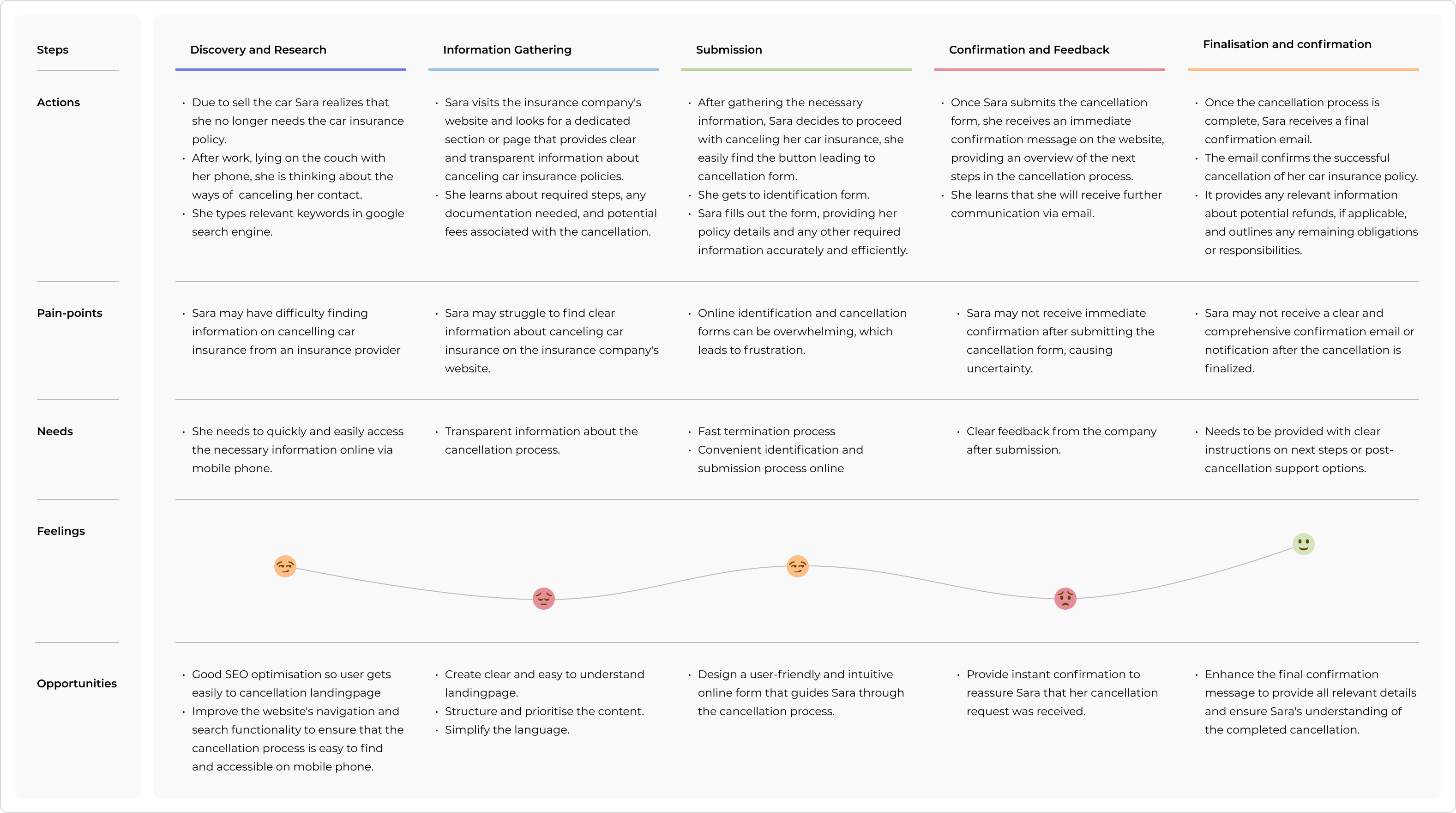
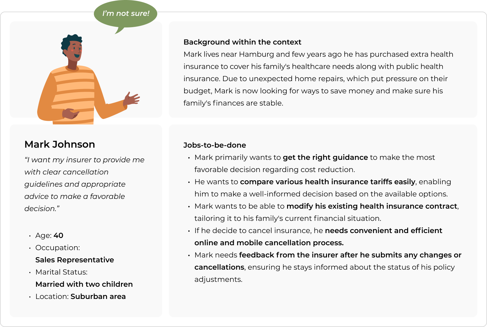
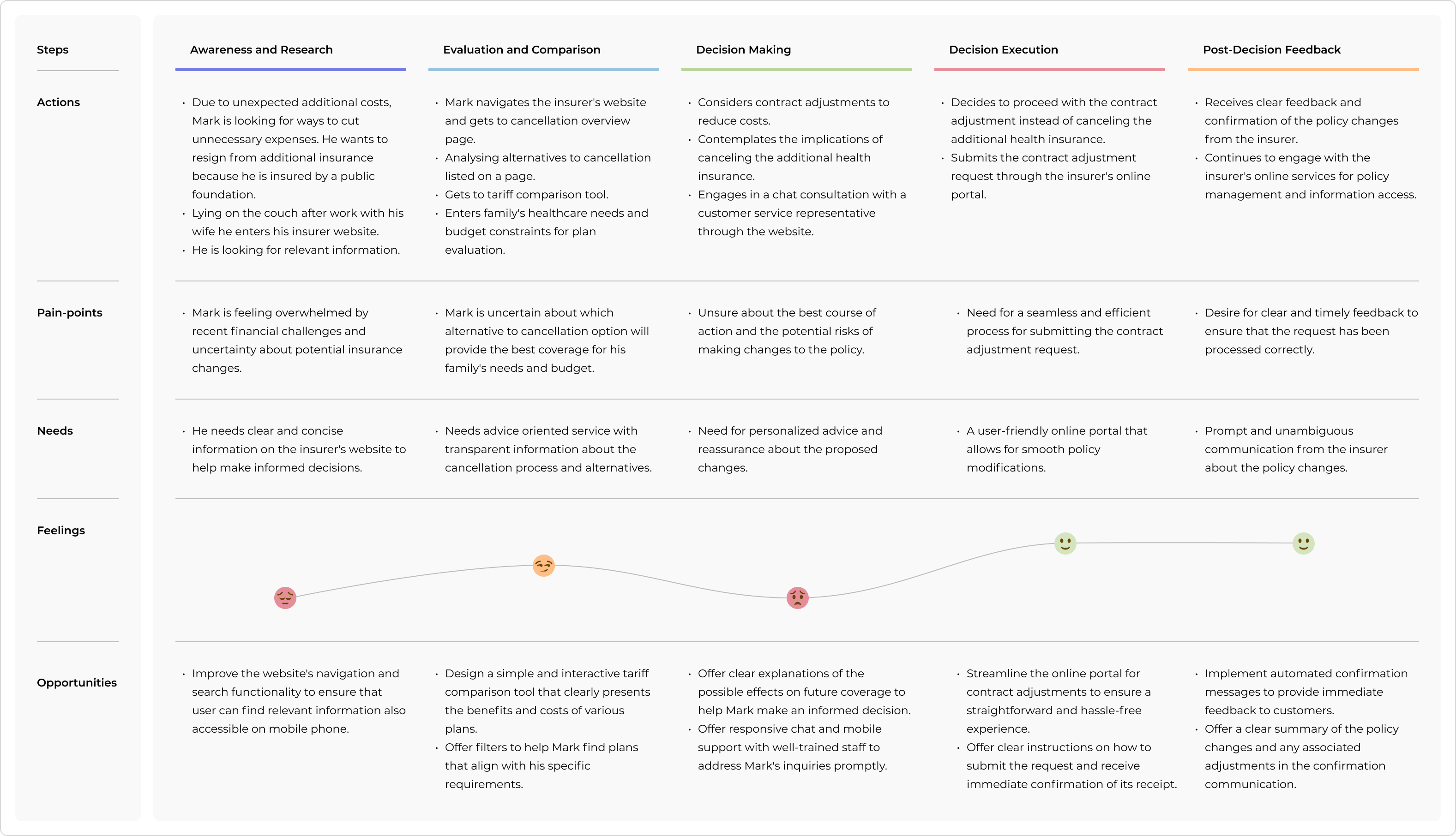
Having in mind two groups I decided to take a closer look into both to understand their needs and pain points better. I created two proto-personas using a jobs-to-be-done framework focus on outcomes. Concurrently, I developed a user journey map to visualize the user’s interaction with the service, highlighting pain points and opportunities for improvement.
Proto-Persona & Customer Journy Map of the user who already decided to cancel the contract
Proto-Persona & User Journey Map of the user who is unsure about canceling a contract
Problem statement
With these insights in hand, I progressed to framing a concise problem statement using the “how might we…” framework. This allowed me to distill the user challenges and aspirations into a precise question that guided our ideation phase.
- How might we streamline the insurance cancellation process, ensuring transparency and clear communication, so that users can easily terminate policy without unnecessary complications or confusion.
- How might we effectively speak to customers who want to cancel their contracts and guide them toward finding the best solution for their needs, so that they feel supported and satisfied throughout the process.
3. IDEATE
The ideation phase was characterized by ideation sessions with the cross-functional team, leveraging various creative techniques such as brainstorming and idea sketching. This collaborative effort allowed us to generate a wide array of potential solutions.
Solutions
Adopting a “Mobile First” strategy, our solution encompasses:
- Cancellation Landing Page: Transparently outlines conditions and process.
- Cancellation Form: User-friendly and direct termination.
- Transparency and Security: Clear communication of steps, fees, and secure authentication.
- Support and Reassurance: Assistance options and confirmations.
- Feedback Loop: Continuous improvement through user insights.
Next steps
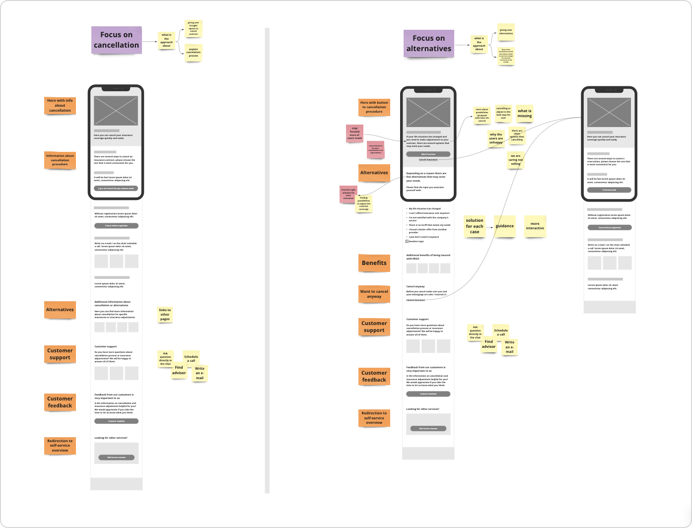
At first, we decided to focus on the landingpage, where the user decides whether he or she wants to cancel the insurance definitely or not. Having two groups of users in mind, we wanted to create an approach that responds to the needs of both groups.
We decided to create two variants for further validation:
- Focus on direct cancelation:
- give the user straight option to cancel contract
- clear and transparent information about the cancellation process and procedure
2. Focus on providing alternatives based on user needs:
- show other possibilities besides cancelation: tariff comparison, contract adjustment, customer support
- cancellation as an option on the landingpage
Blockframing
Starting with blockframing to explore and ideate potential solutions. That helps to focus on the overall composition and organization of content without getting into specific details or visual design aspects, keeping in mind the user’s pain points and motivations.
4. PROTOTYPE
Next I moved on to wireframing, creating hi-fidelity sketches to refining the ideas generated during blockframing and provide a clearer picture of the design’s information architecture.
The wireframes were thoughtfully created to test solutions with users, enabling valuable feedback that informed iterative improvements.
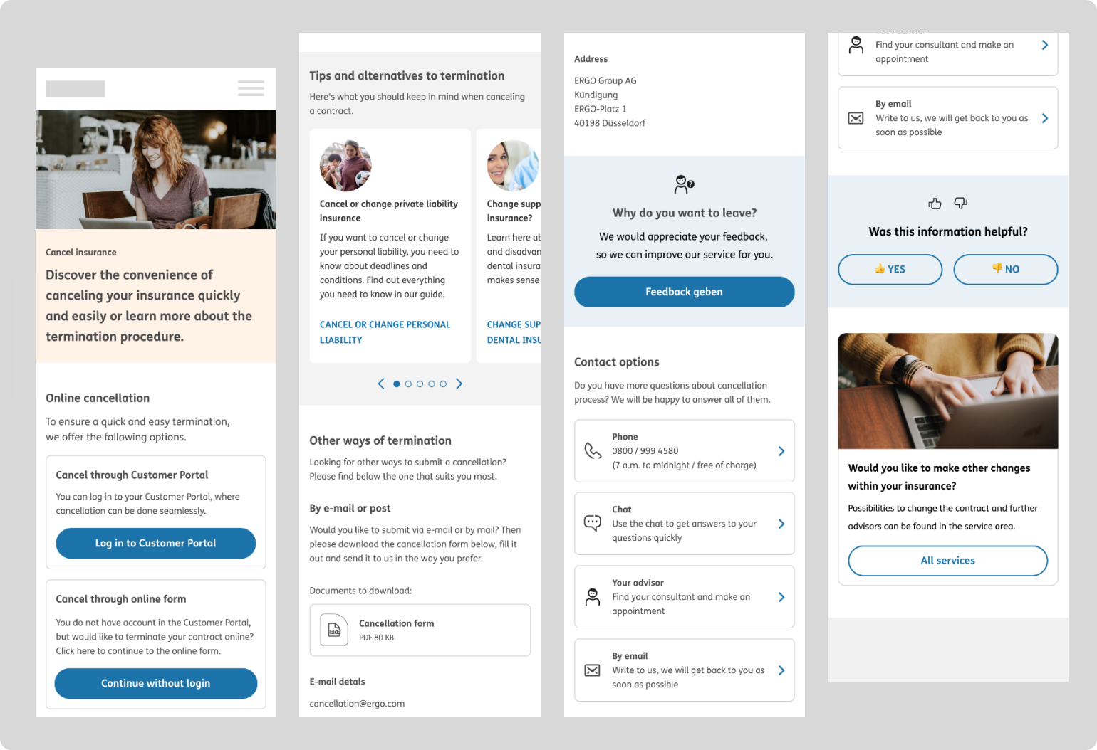
Version A
- Landing page focus: highlighting all cancellation paths (online /offline)
- Highlighting of online cancellation paths via customer portal & online form
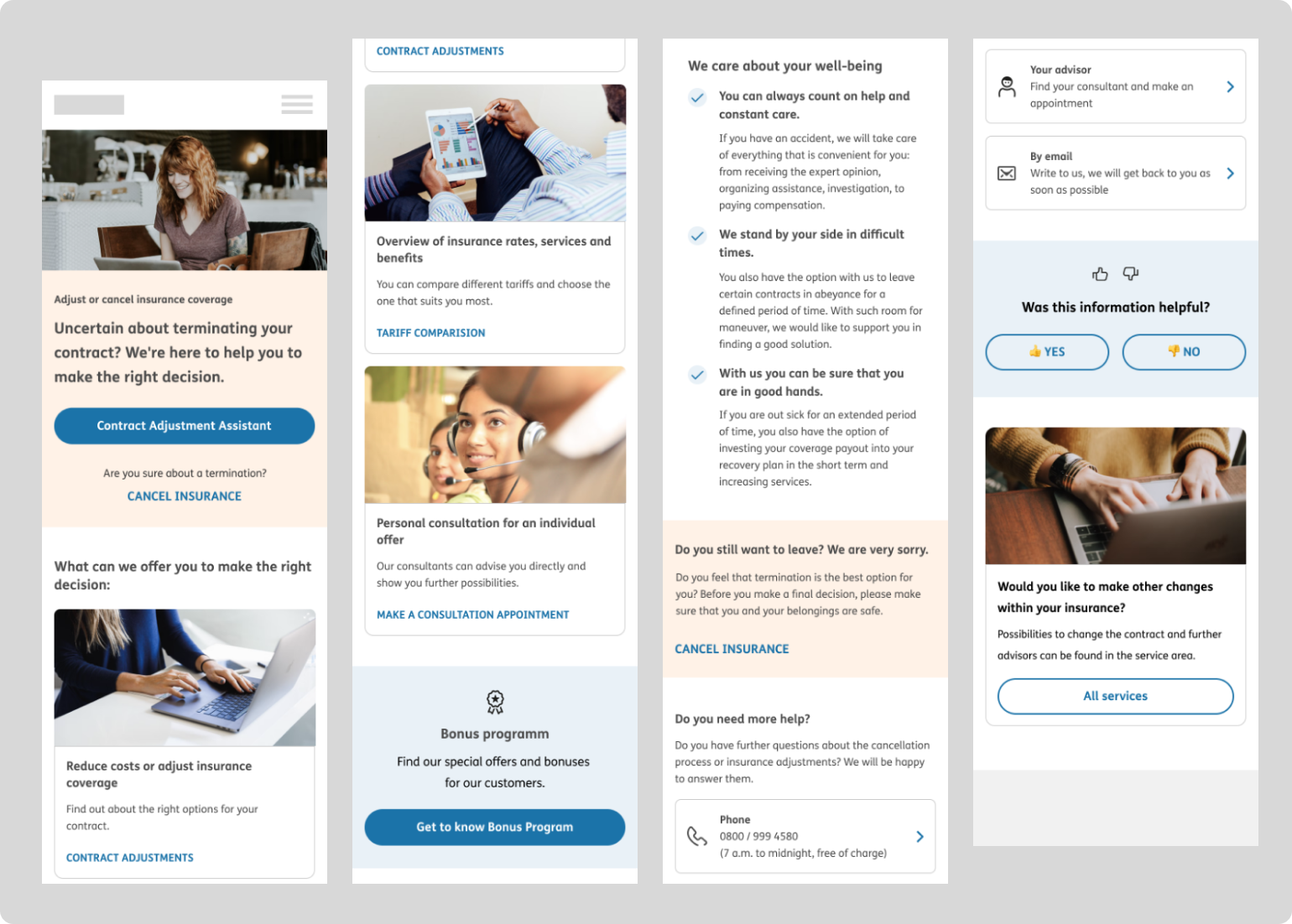
Version B
- Landing page focus: communicating alternatives and online customization options
- Cancellation as an option on the landing page
5. TEST
I conducted remote usability testing with 7 participants lasting 20 minutes. Testing was unmoderated asking users to think aloud. We recruited users who, among others, have resigned from their insurance in the last 6 months. We wanted to learn about their actual experience, pain points, and what they were looking for during the cancellation process.
The main research question
How can we guide customers so that they can easily and quickly find the best solution for their needs when they want to cancel their contracts?
Test concept
During the testing phase, we engaged users to perform a certain task using two different variants. The main goal was to study user preferences and gather information on which variant provides a more favorable and effective interaction.
Main findings
- In general customers favor variant B – focus on alternatives with cancellation as an option.
- Customers favor simple, secure, and fast online submission channels for cancellations.
- Customers want online suggestions for contract adjustments as an alternative to cancellation.
- Customers want easy and guided online ways to change their contracts independently.
Recommendations
- Simplified Cancellation Process: Offer an intuitive online cancellation platform that’s easy to navigate, ensuring swift and secure cancellation submissions.
- Highlight Alternatives: Enhance the visibility and clarity of contract alternatives based on user preferences, aiding decision-making beyond simple cancellations.
- Independent Contract Changes: Enable users to modify their contracts independently through a user-friendly online interface, with clear guidance at every step.
Key learnings at this stage of the project
- Transparent Communication: Clear and transparent communication emerged as a crucial factor. Users appreciated knowing exactly what to expect during the cancellation process, including steps, fees, and potential alternatives. Transparency not only builds trust but also reduces user frustration.
- Mobile Optimization: Recognizing the significance of mobile devices, adopting a “Mobile First” strategy helped in creating an inclusive and convenient user experience. Making the process accessible via smartphones enhanced the usability and accessibility of the cancellation experience.
- Diverse User Groups: Addressing the needs of two distinct user groups (those committed to cancellation and those unsure) demonstrated the importance of customization and providing different pathways to accommodate varied user intentions.
- Alternatives to Cancellation: Offering alternatives such as contract adjustments and tariff comparisons showcased a forward-thinking approach. Providing these options not only retained users but also empowered them to make informed decisions about their insurance policies.
Continuation: Designing the cancellation process with cancellation form
After finalizing the design of the cancellation landingpage following user insights from testing, our focus shifted towards the next critical phase: crafting an efficient and user-friendly cancellation process, complete with a thoughtfully designed cancellation form. Our overarching goal remained unwavering – to create a sustainable digital solution that empowers customers to seamlessly cancel their insurance contracts with ease and effectiveness.